


The Problem with Mercator Projection
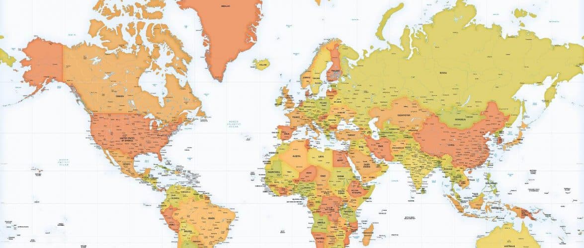
Most world maps that we see use the Mercator projection to display the world. The Mercator projection is a cylindrical map projection created in 1569 by Flemish geographer and cartographer Gerardus Mercator. Gerardus Mercator created this projection to aid navigation because it preserved local angular relationships, making navigation easier.
However, it is not possible to display the spherical, three-dimensional Earth on a flat surface. All map projections distort the actual layout of the Earth to some degree, including the Mercator projection. The Mercator projection massively distorts both the size and distances as you get closer to the two poles.
Mercator’s map projection increases the sizes of Europe and North America while Africa, South Asia, and South America all appear much smaller. In the Mercator projection, Africa looks smaller than Greenland. In reality Africa is about 14.5 times larger!
Almost everyone has a skewed perception of the true size of countries because of the popularity of the Mercator projection.
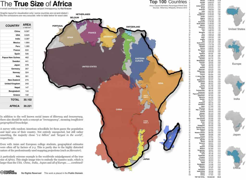
The True Size of Africa
Kai Krause, a German software and graphical user interface designer, created an image to illustrate just how big Africa is without map distortion. It shows the true size of the continent of Africa in relation to various countries mapped by land area.
“Africa is so mind-numbingly immense, that it exceeds the common assumptions by just about anyone I ever met,” he writes at his website. “It contains the entirety of the US, all of China, India, as well as Japan and pretty much all of Europe as well – all combined!”
Furthermore Krause said:
In addition to the well known social issues of illiteracy and innumeracy, there also should be such a concept as “immappacy,” meaning insufficient geographical knowledge. A survey of random American schoolkids let them guess the population and land area of their country. Not entirely unexpected, but still rather unsettling, the majority chose “1-2 billion” and “largest in the world,” respectively. Even with Asian and European college students, geographical estimates were often off by factors of 2-3. This is partly due to the highly distored nature of the predominantly used mapping projections (such as Mercator). A particularly extreme example is the worldwide misjudgment of the true size of Africa. This single image tries to embody the massive scale, which is larger than the USA, China, India, Japan, and all of Europe … combined!
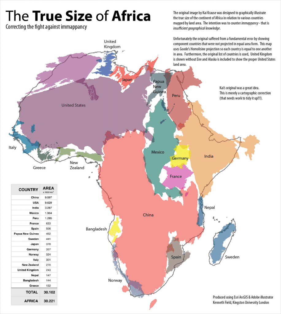
The visual impact of the Krause Africa map is shocking. Unfortunately, it’s not perfect. The original map suffered from a fundamental error by showing component countries that were not projected in equal area form.
The below map uses Goode’s Homolisine projection so each country is equal to one another in area. Furthermore, the original list of countries used, United Kingdom is shown without Eire and Alaska is included to show the proper United States land area.


")
")